Next To Normal - Sydney Musical Theatre
“A quietly brilliant piece of design” - What’s The Show
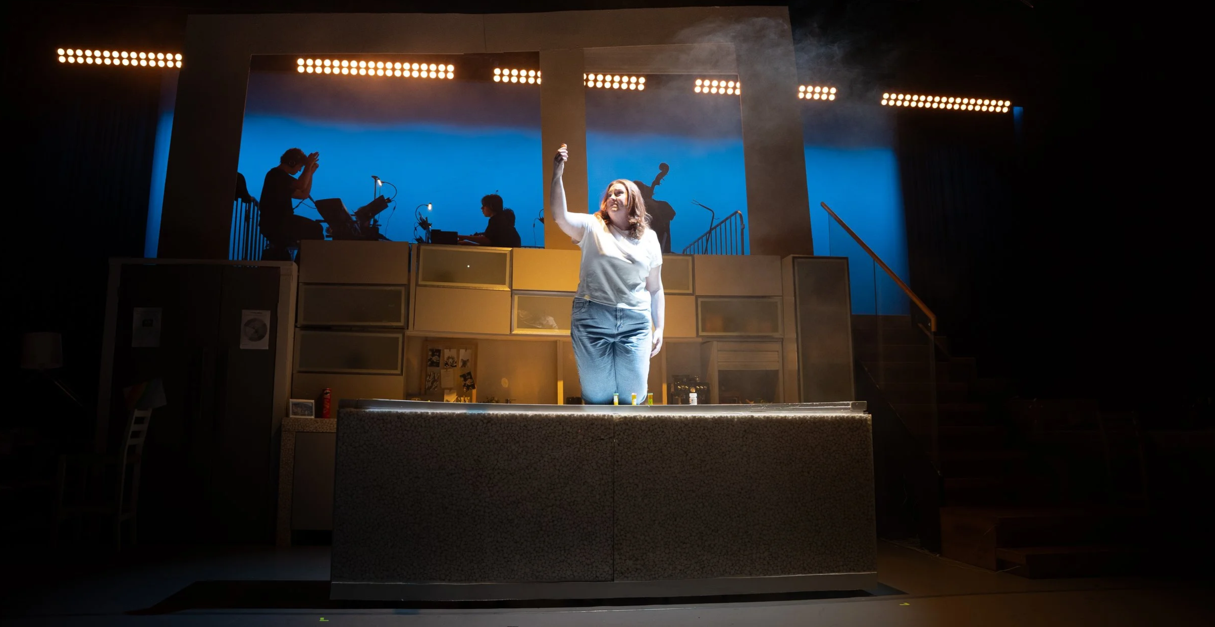
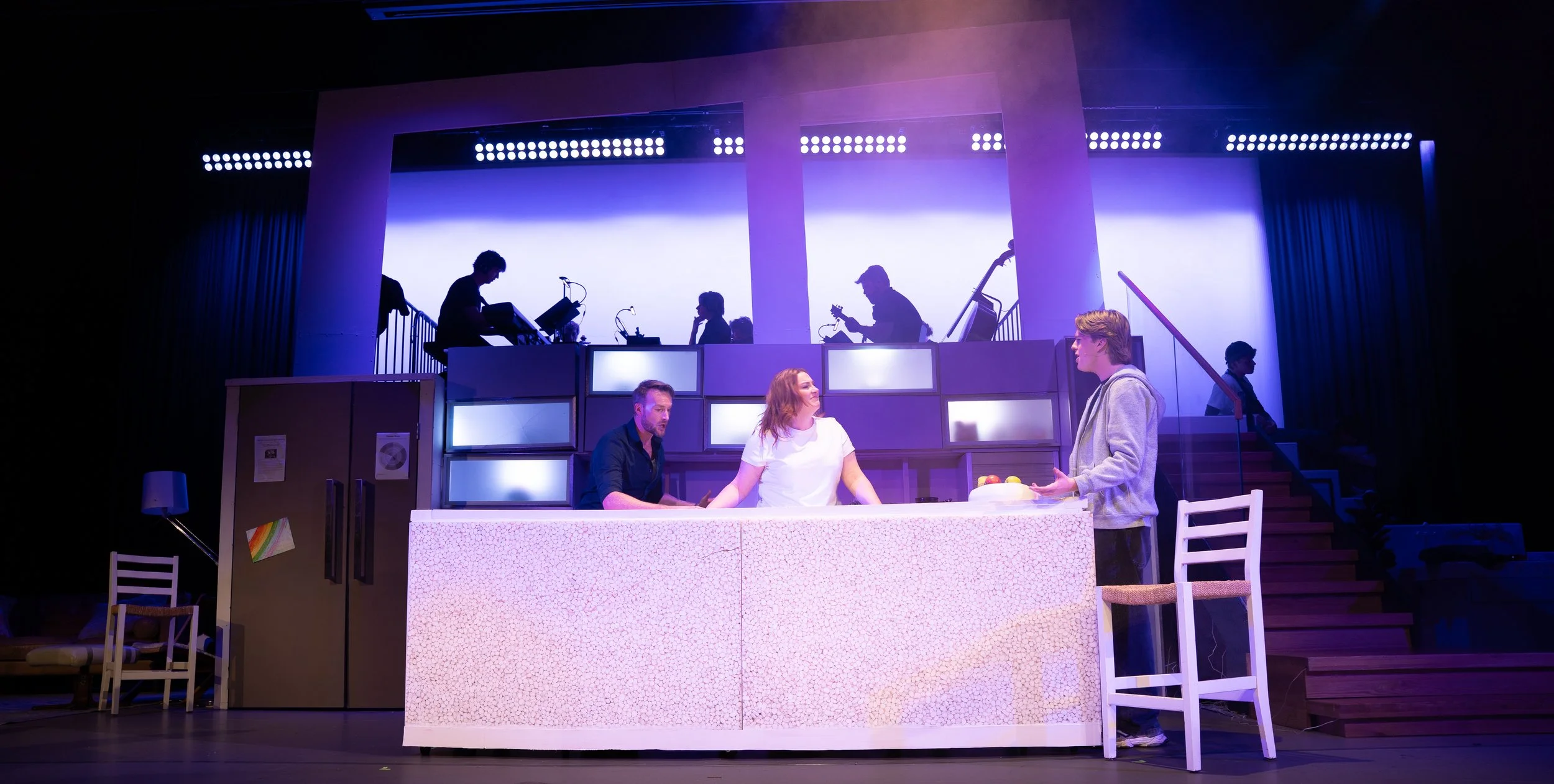
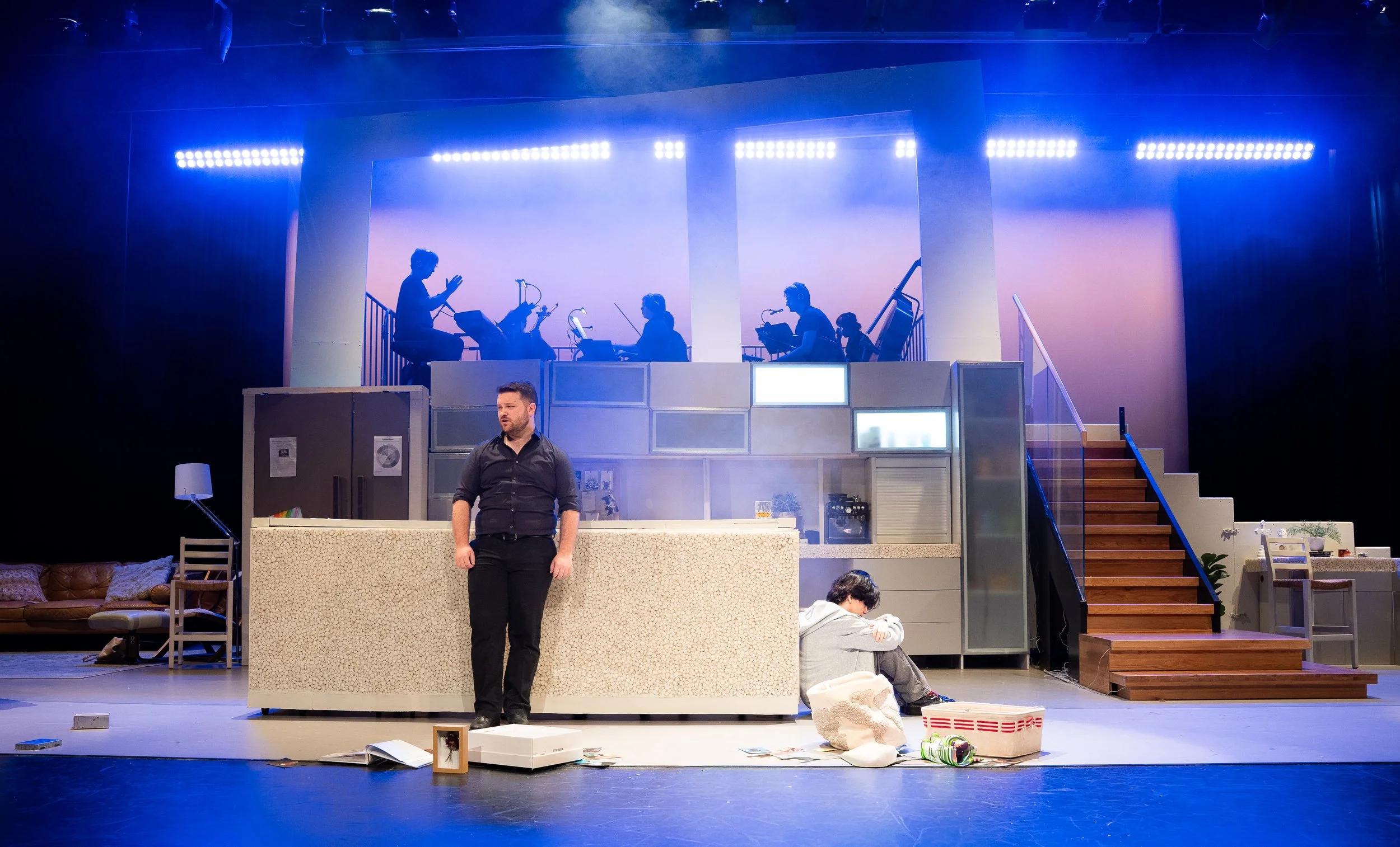
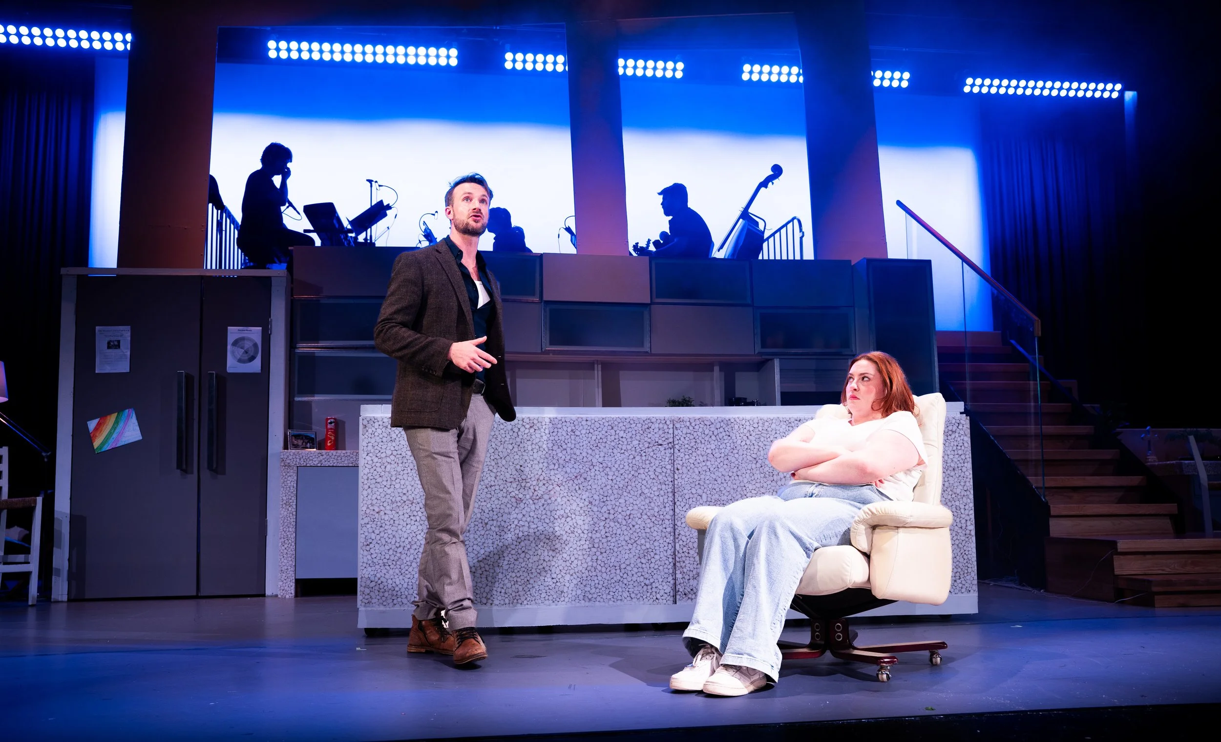
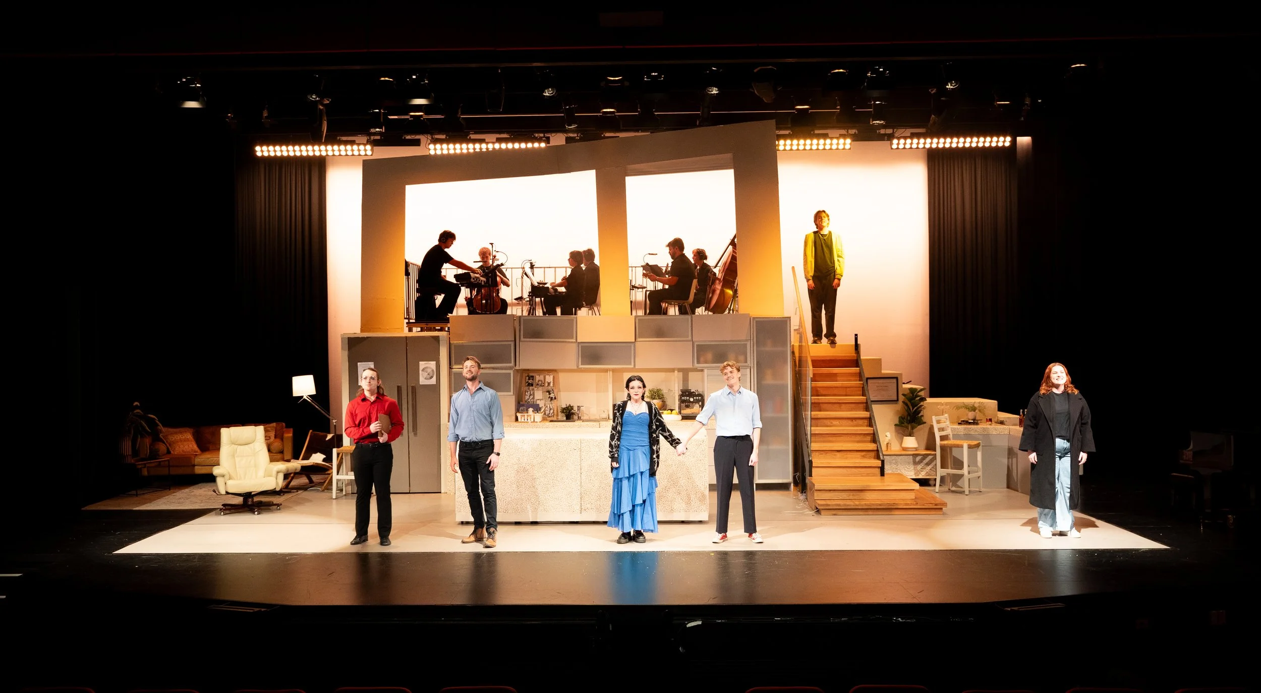
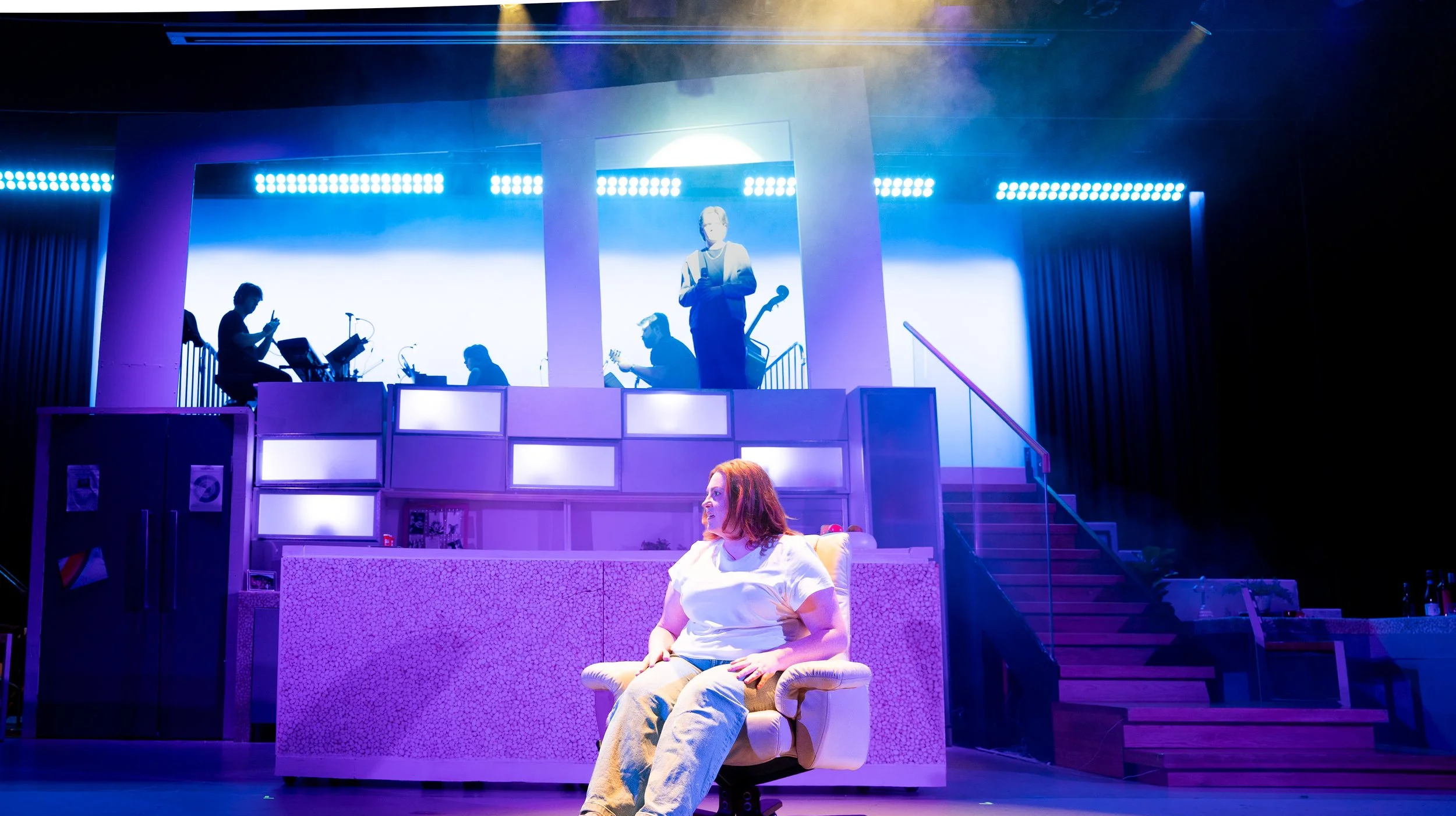
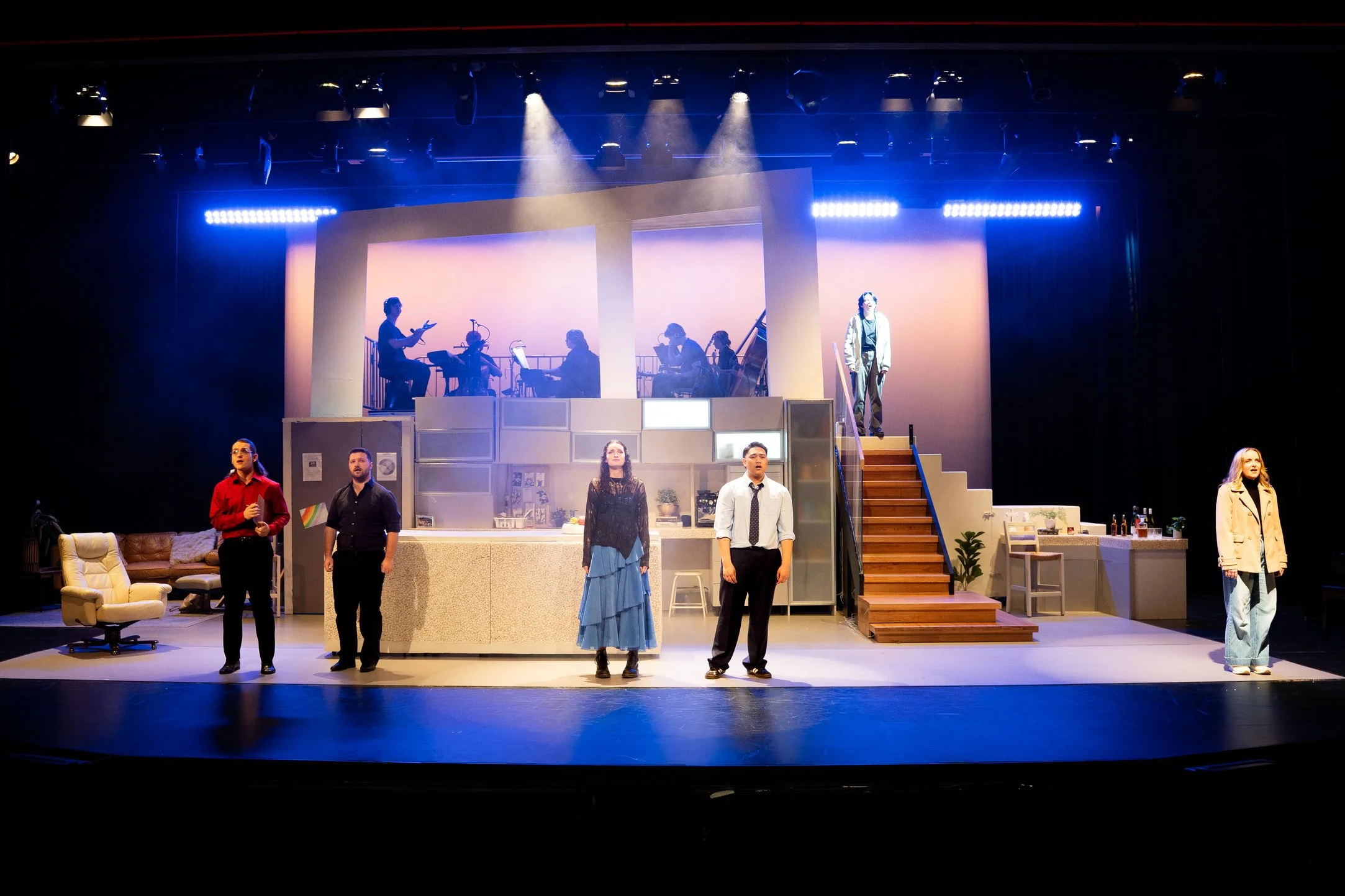
“The set design is a standout element. It is incredibly effective in creating the sense of a real family kitchen that feels familiar and lived in. This ordinary domestic space grounds the story in reality, while also allowing room for projections, electricity, and other visual effects that represent the gradual crumbling of the home’s familiarity.” - The Scoop
“The design cleverly displays the emotional distance that keeps them each in view but just out of reach in such a fractured reality.” - Theatre Thoughts
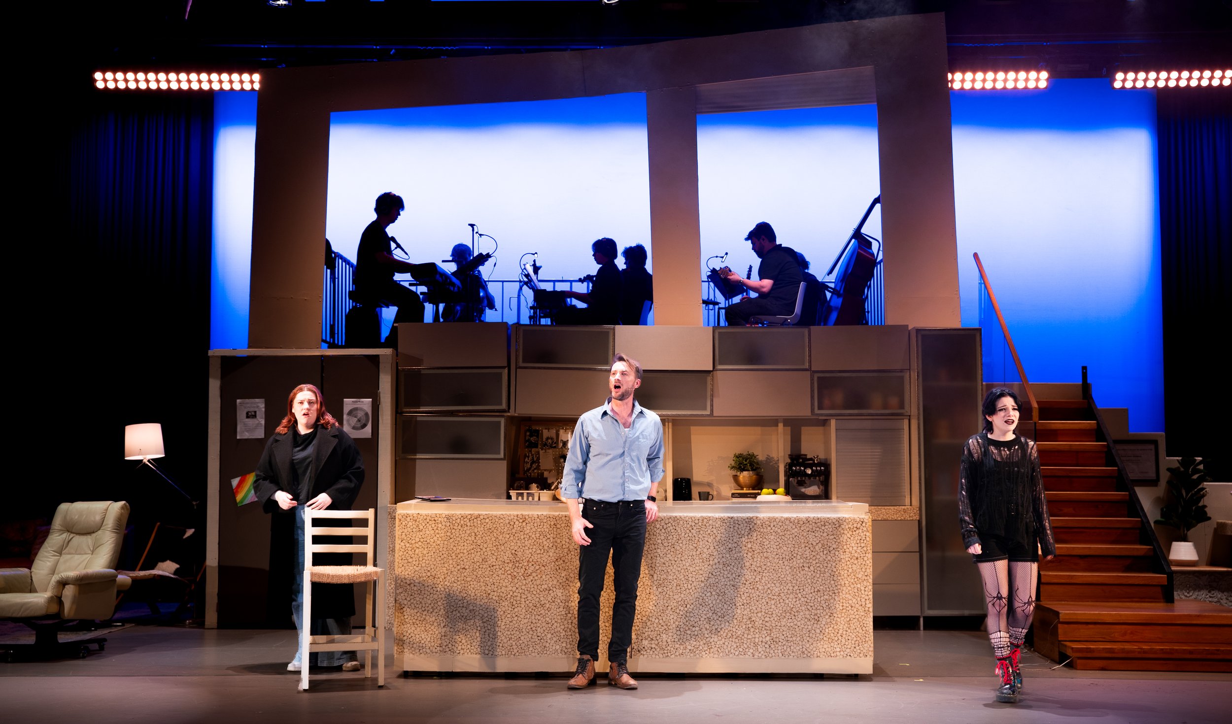
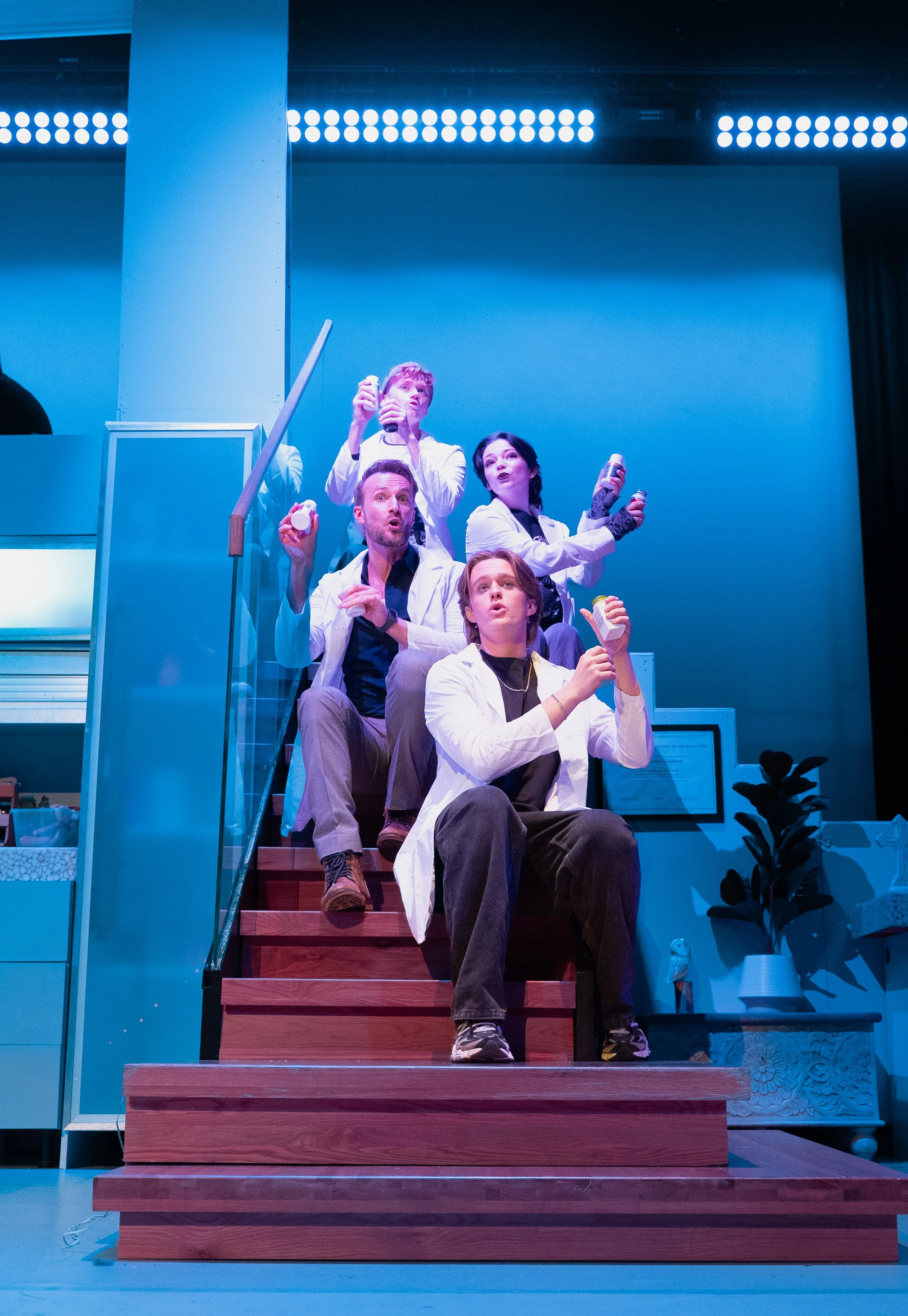
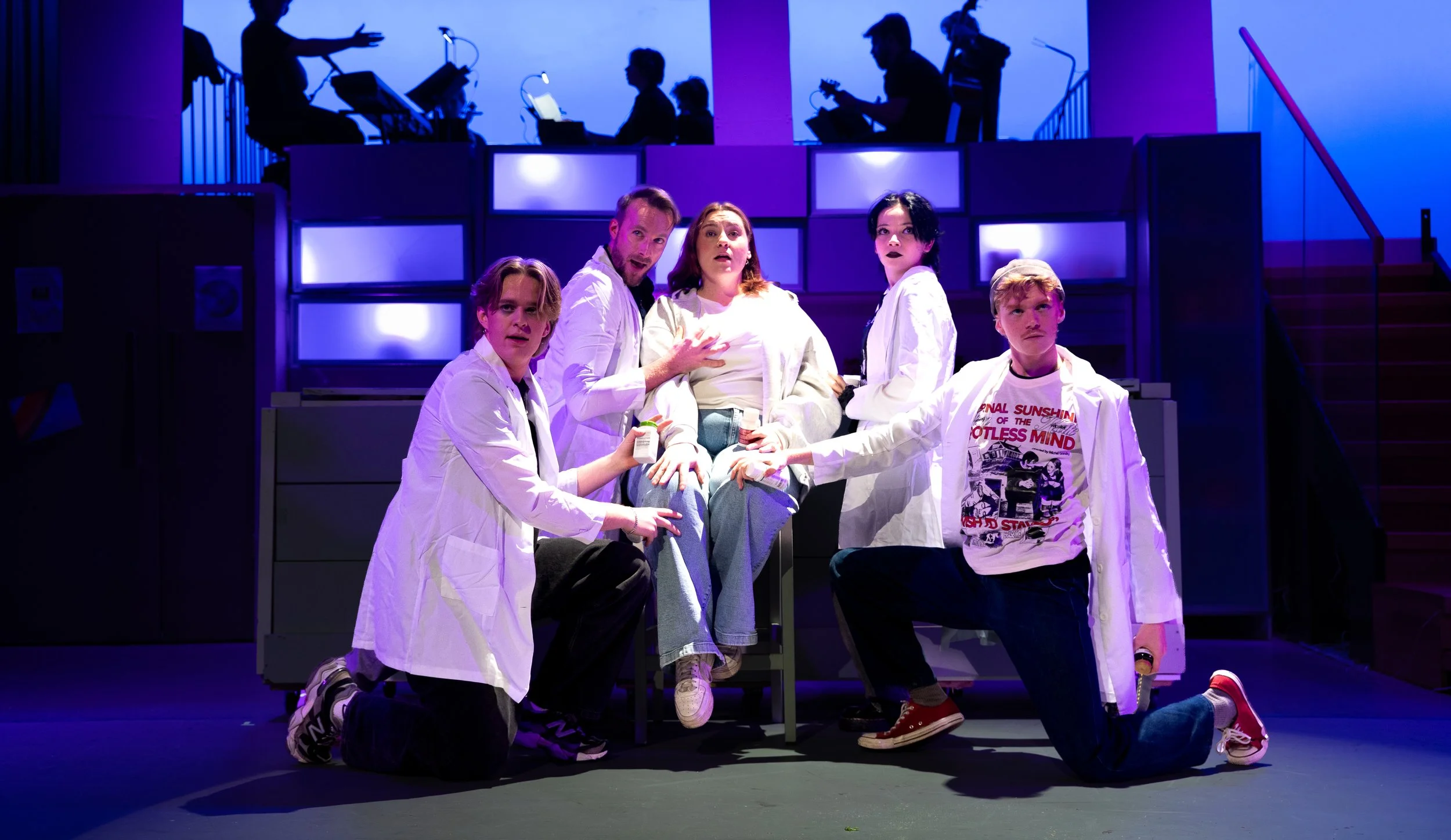
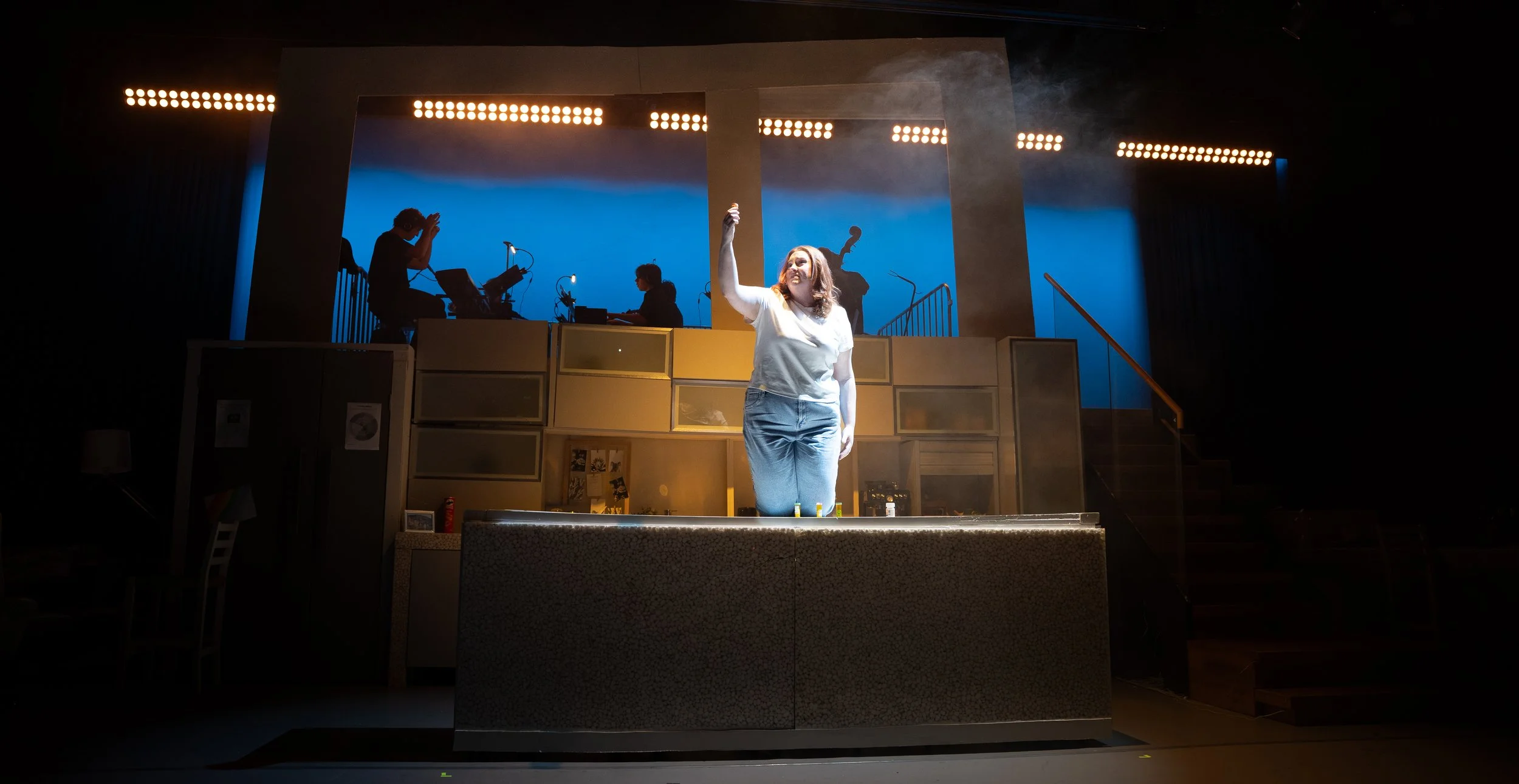
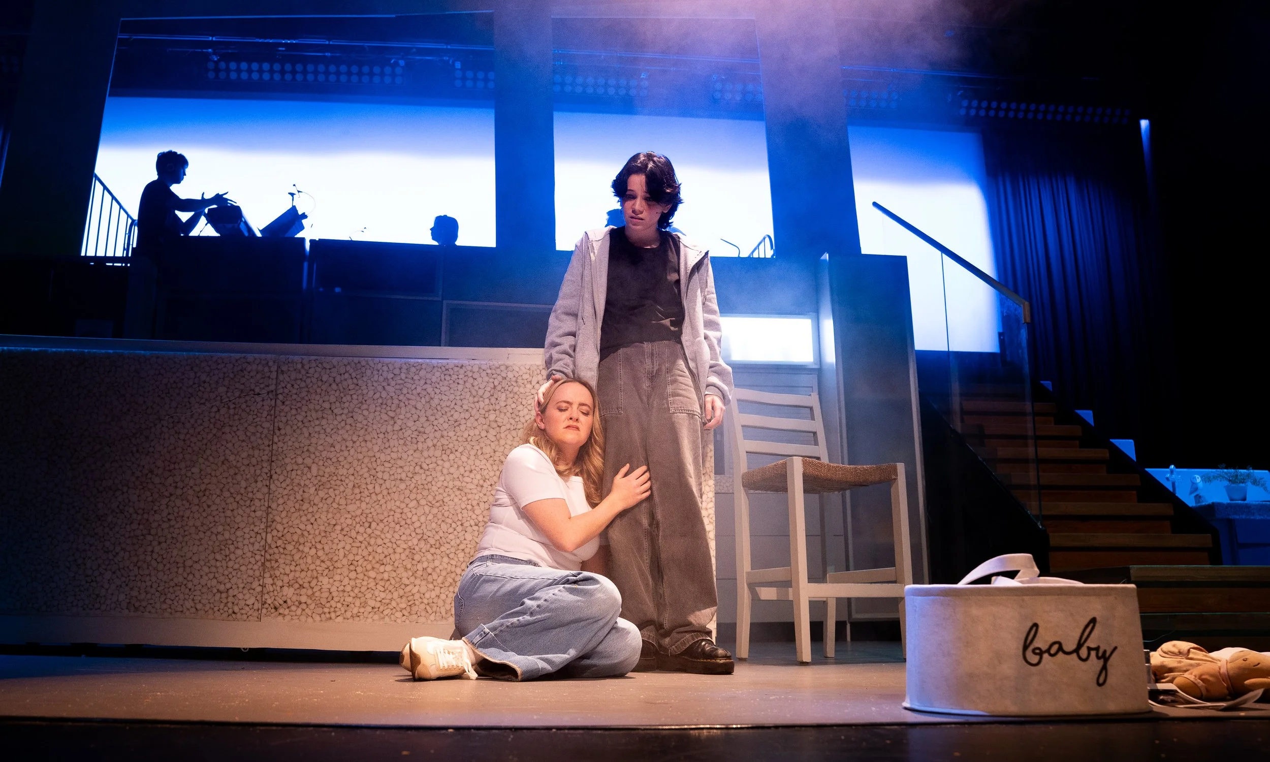
Next To Normal is a very important and well-told story about mental health, grief, family, love and so much more. The heavy content of the show requires great attention to detail in all technical aspects both on and off stage to do it justice. Understanding the intricacy of the Goodman family’s story had such an impact on my designs for the production. I am very grateful to have worked along such a talented and professional group of cast and crew who brought the story to the stage with such honesty.
Progress
Set Design
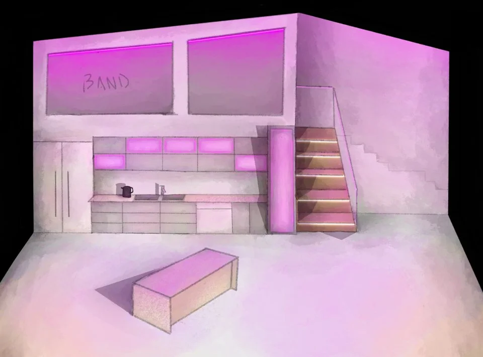
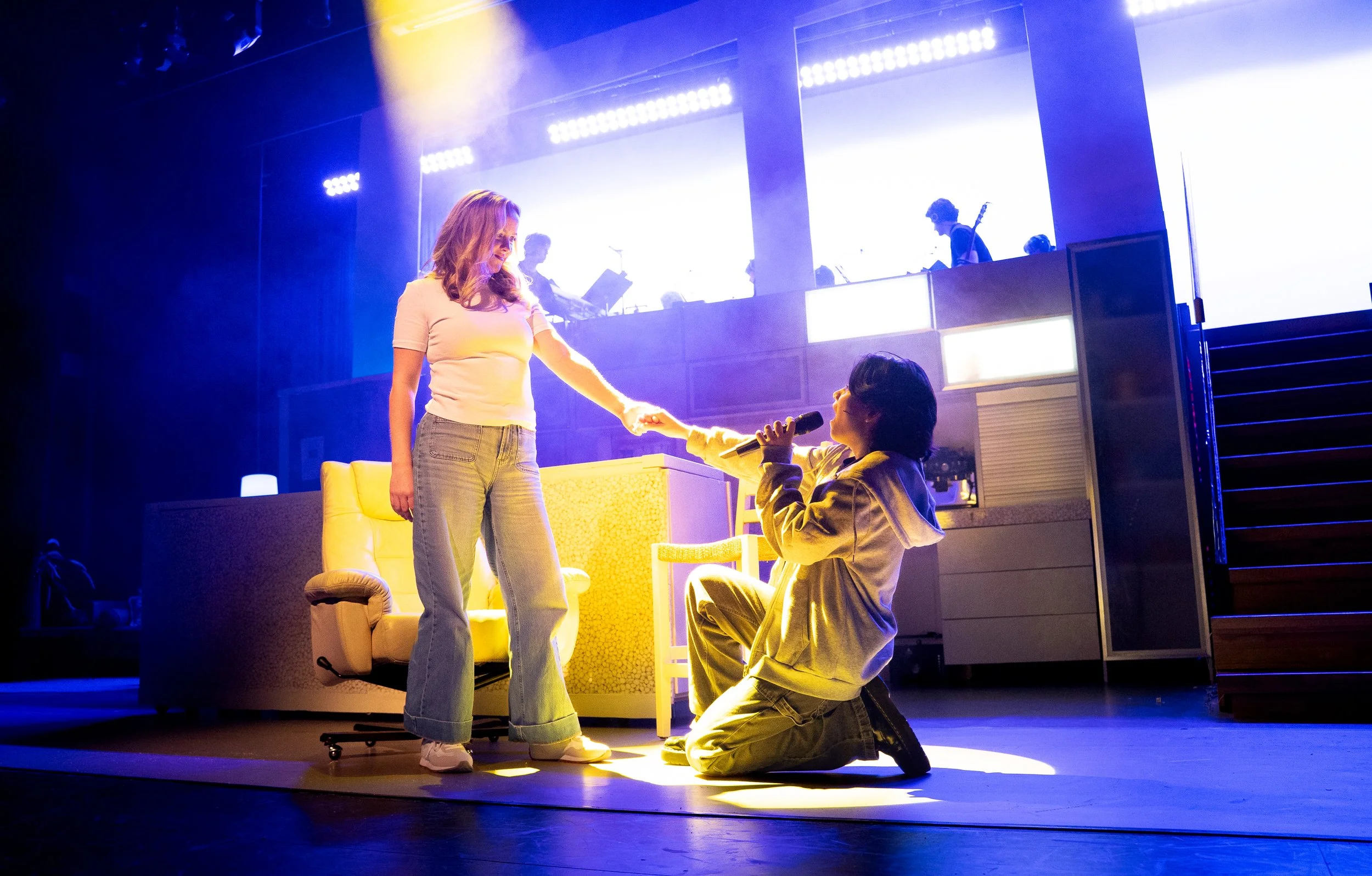
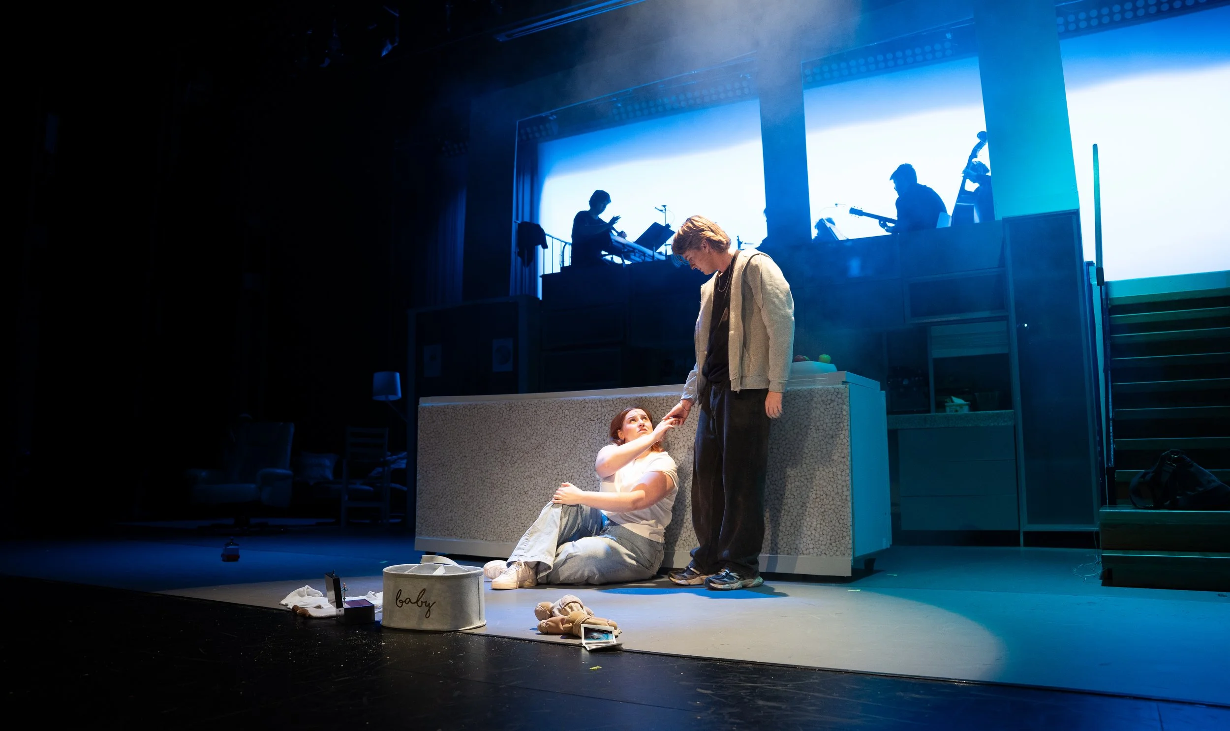
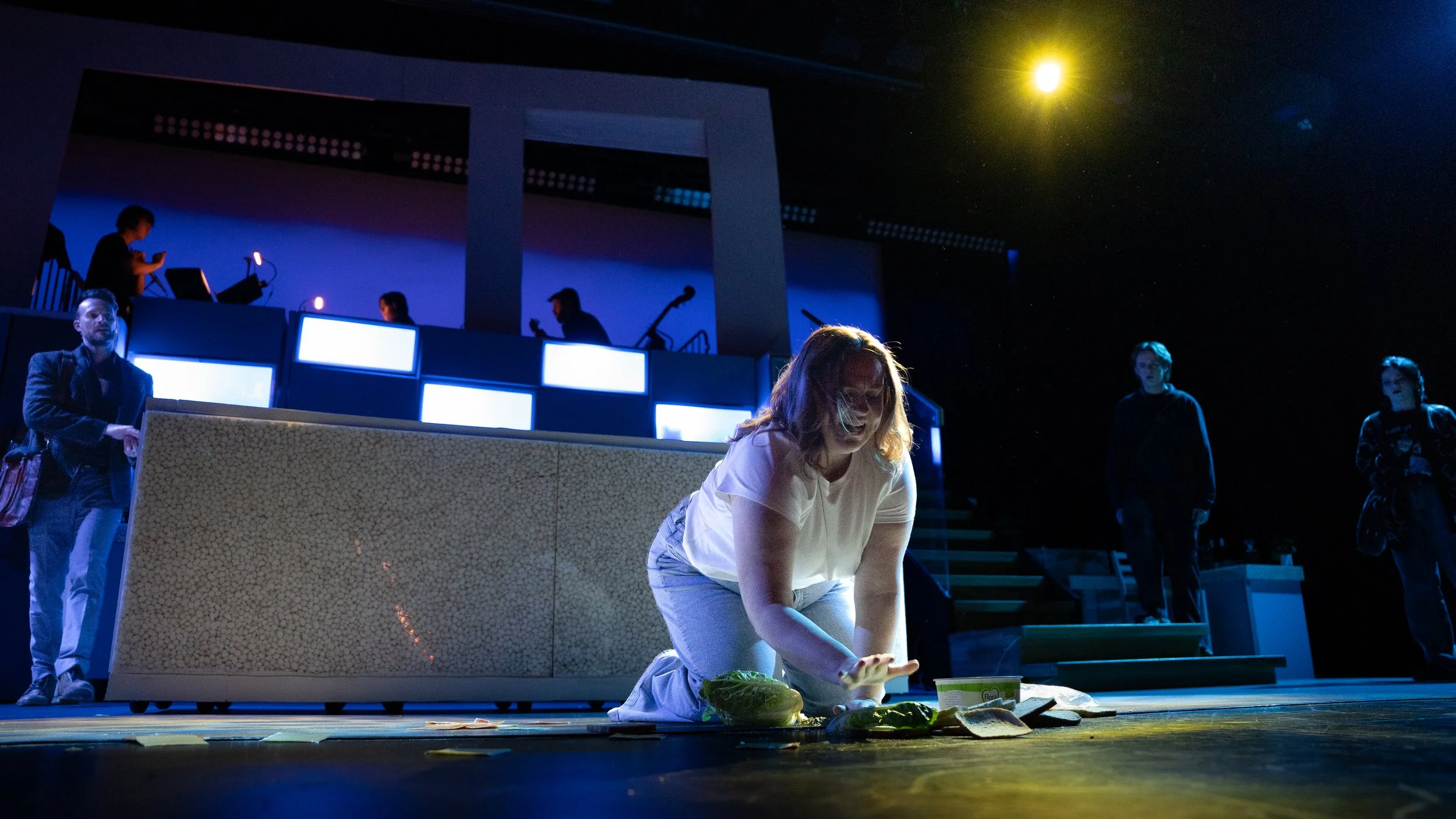
When designing the set and scenery for Next to Normal, I understood that every element needed to be reflective of the characters and story to effectively convey the depth of the narrative. I did a lot of research on both the musical’s portrayal and real life accounts of mental health and grief to further influence the intention behind my designs. And as always, a design is never 100% accurate to the concept, especially if changes are necessary to support the show/venue.
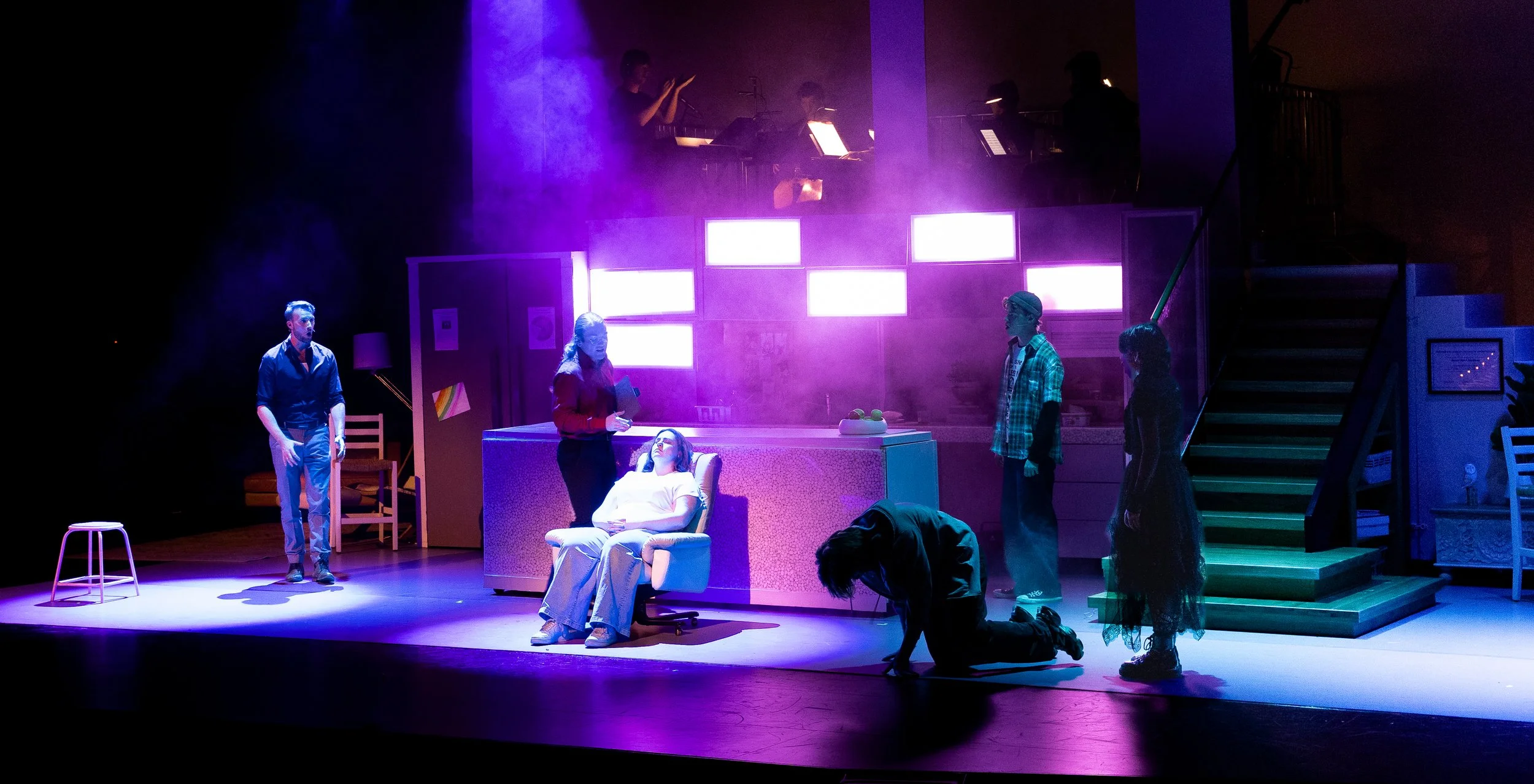
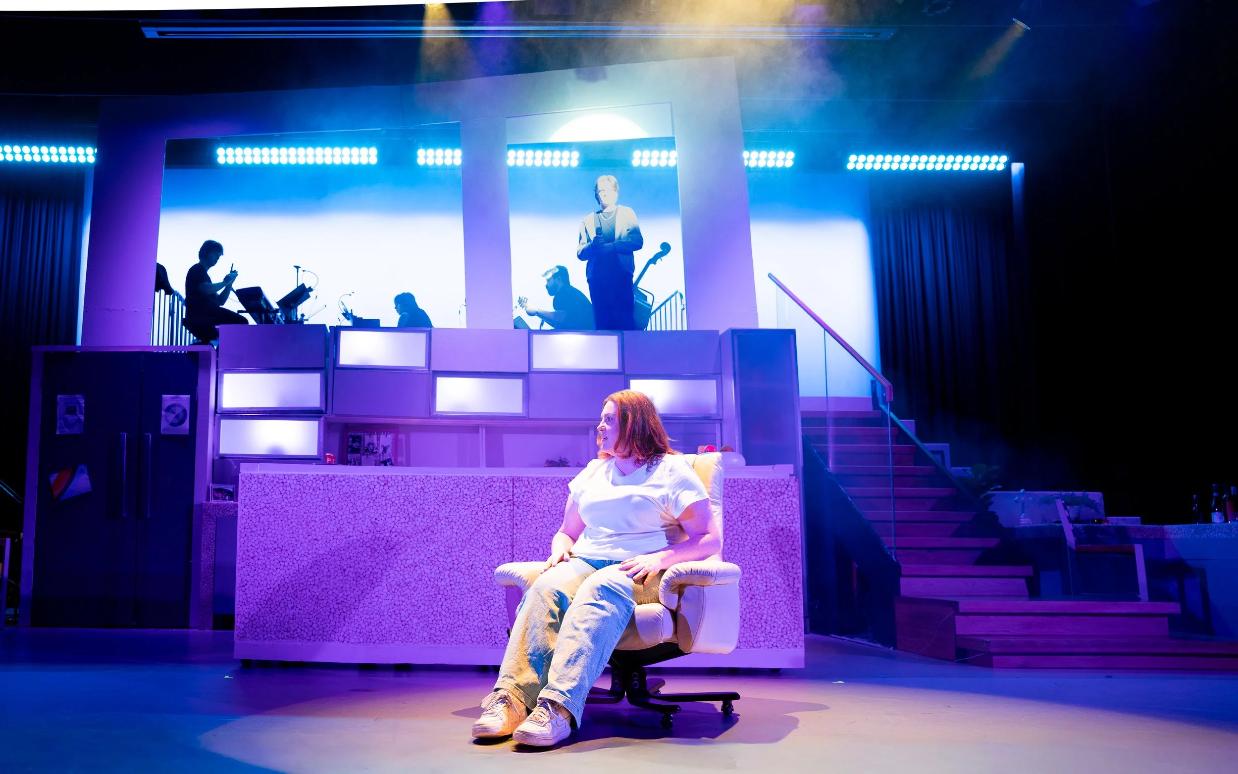
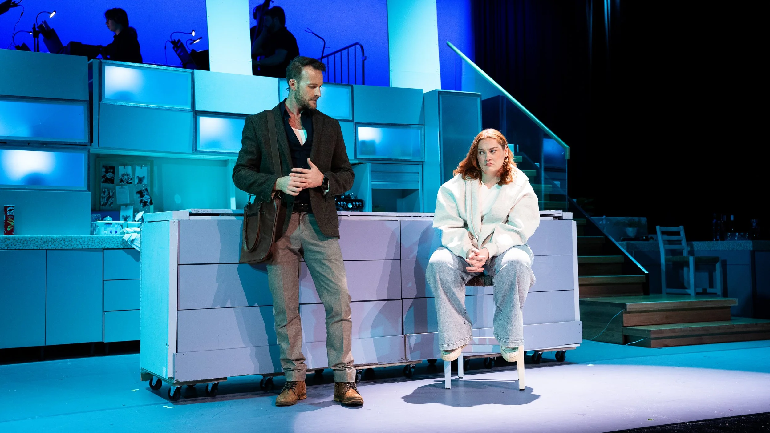
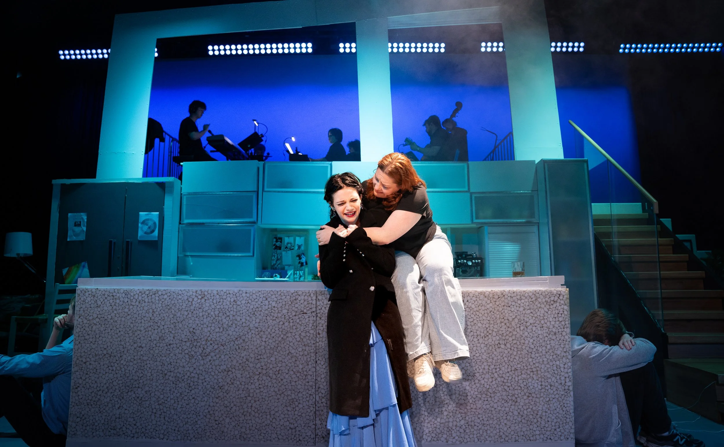
While I researched both pro versions of Next to Normal, the West End portrayal particularly stood out to me for inspiration. The set was not rock-inspired at all but what seemed to be a normal family home, albeit a bit clinical and prison-like. This concept greatly influenced my approach - the environment needed to reflect what was happening inside it. It is a modern family home owned by two architecture graduates, what seems to be stable is far from it at a closer glance - the top level of the set is abstract and one-dimensional, reflecting the instability of the Goodman family and also Diana’s mental state. There are cracks in the kitchen cabinets, and there are also two staircases - symbolising choice. (I would suppose it’s all a play on the title of the show as well!)
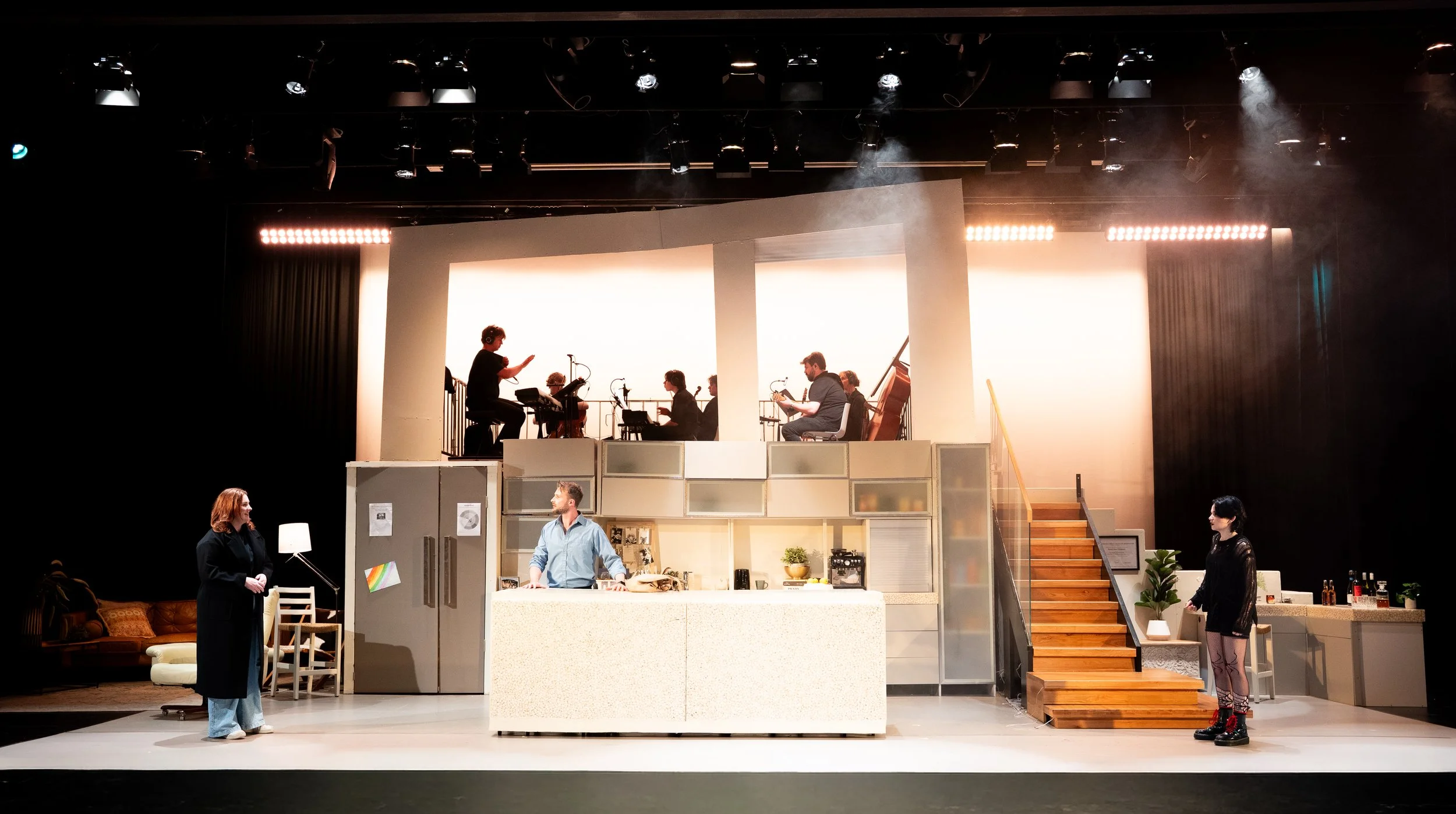
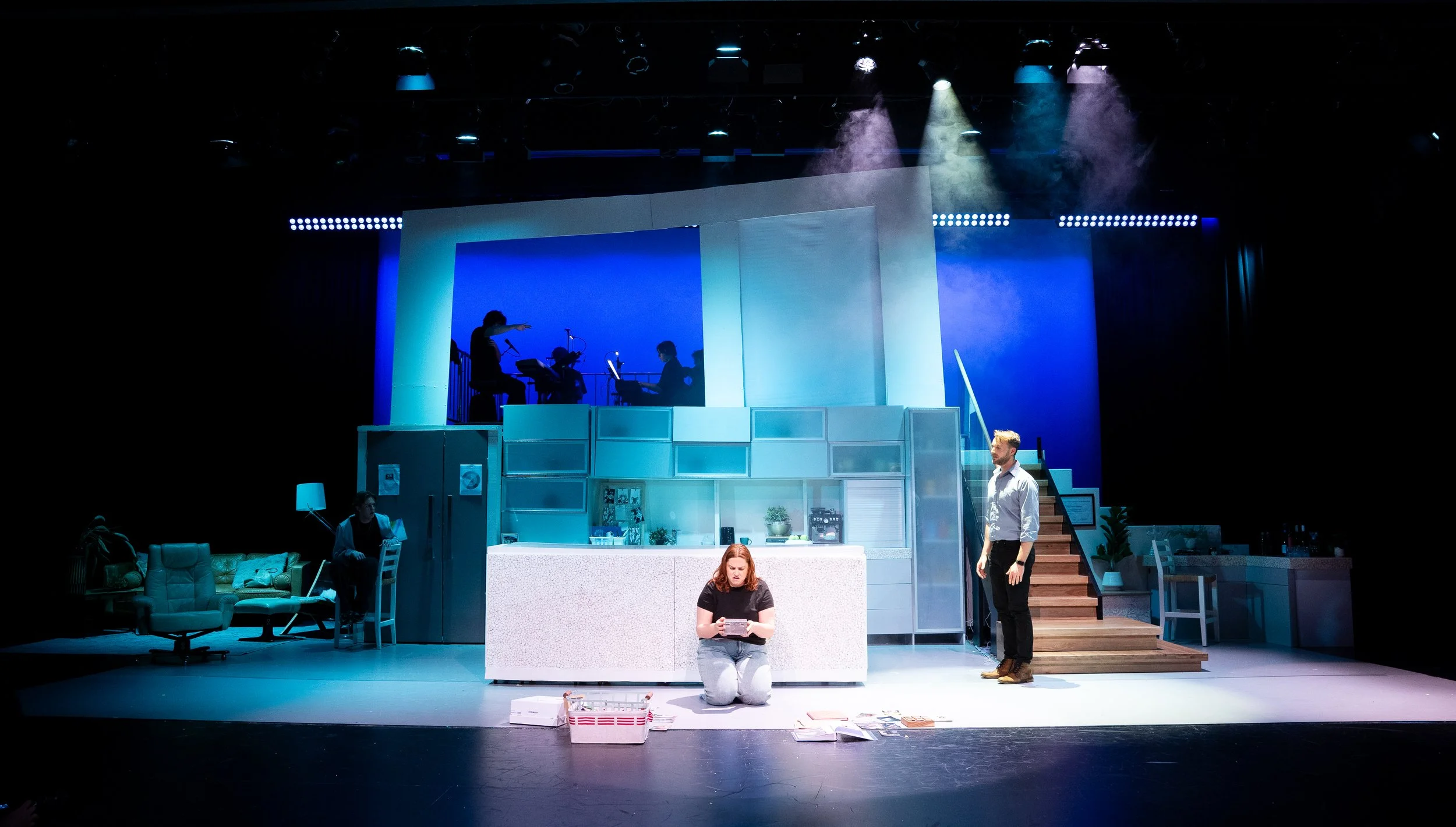
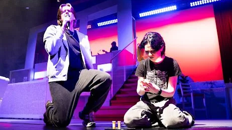
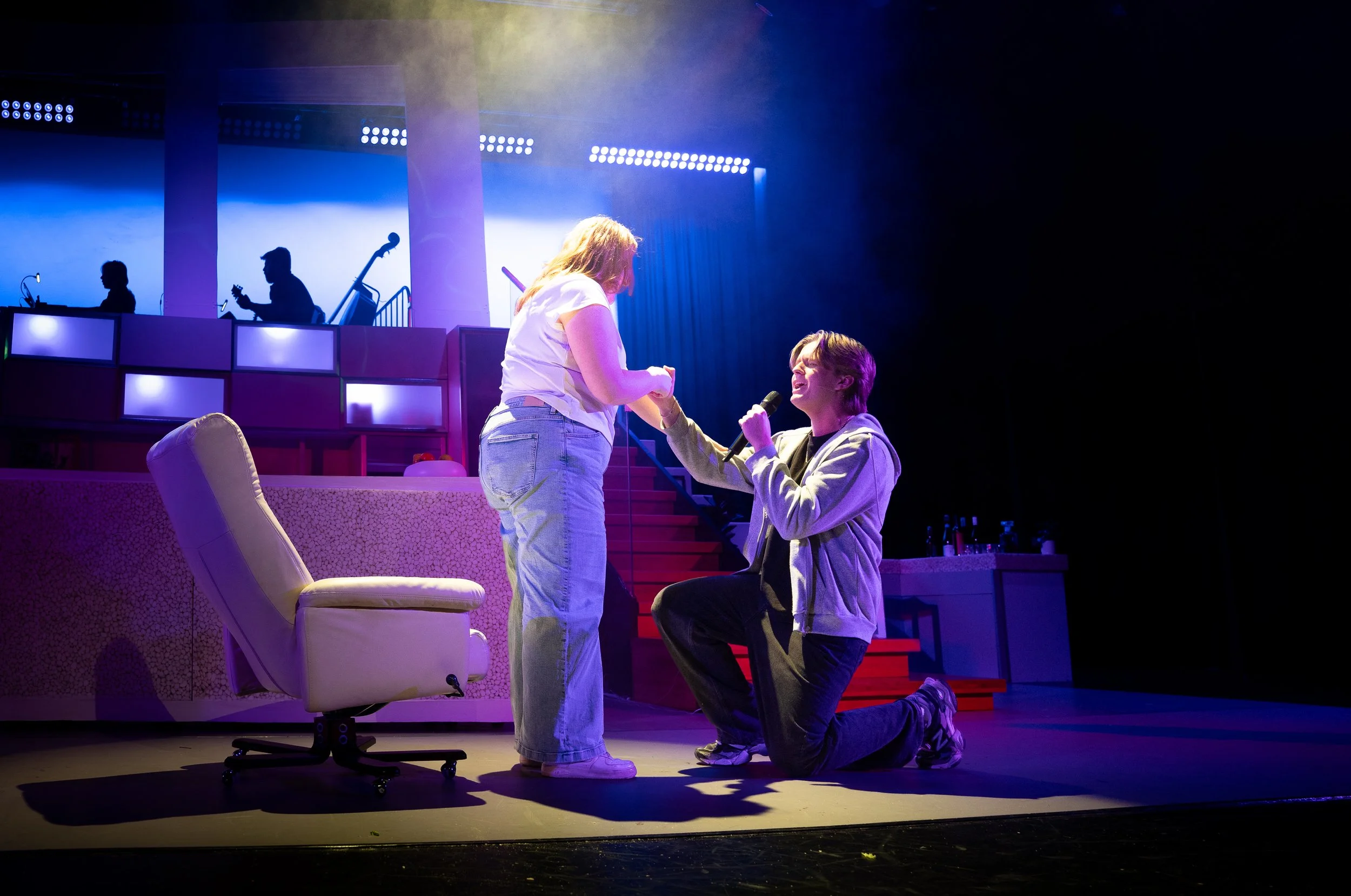
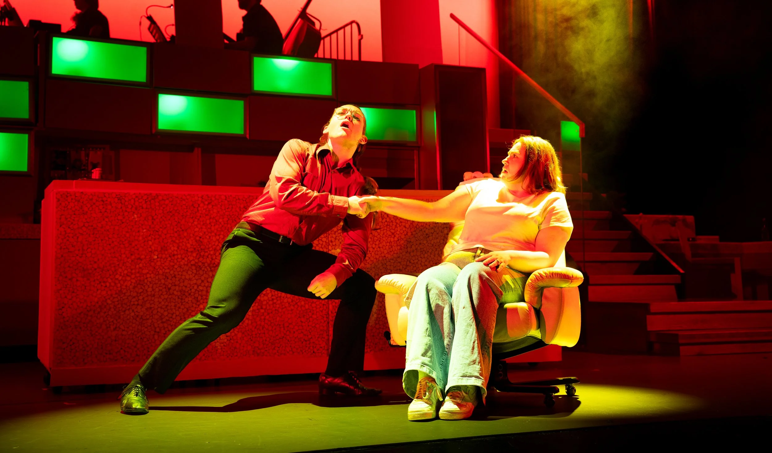
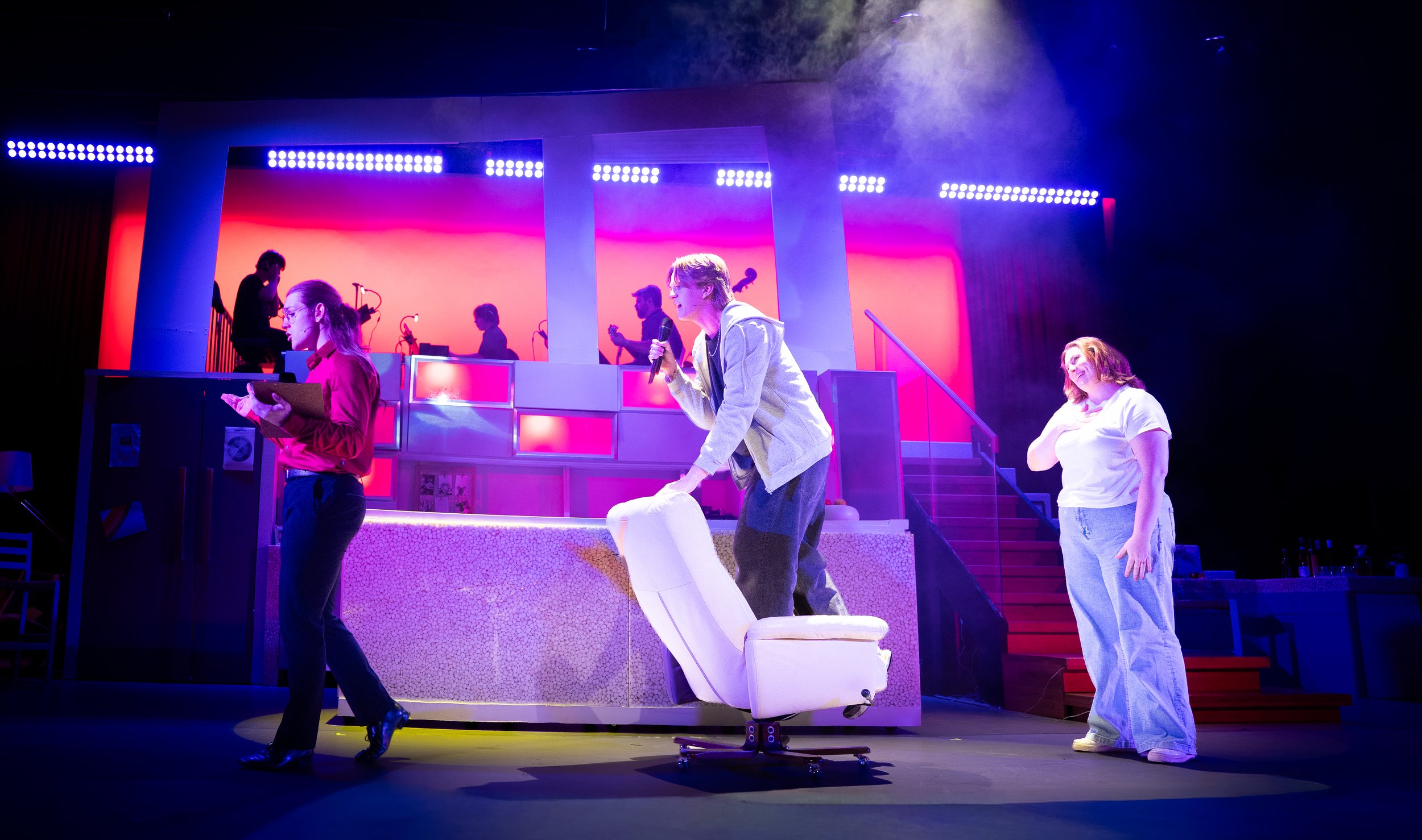
Diving further into the design elements, I collaborated with lighting design to build atmosphere in impactful scenes. We decided early on that the cabinets would light up at integral points in the show - conveying the influence that negative and traumatic moments would have on the family and their home. Alongside this were projections I created to further enhance the story and atmosphere in these moments. The band played a significant role in this idea too, as they were essentially acting as a voice for emotions and illness whilst taking up space in the family home. The set decoration was highly important as well - audiences should feel as if they are really inside the home. We used various props and furnishing items along with family keepsakes to drive this point. These elements did not only enhance the scenery, but they also allowed for a more honest and realistic experience for both audiences and actors.
Costume Design
It may seem like Next to Normal wouldn’t require very intentional or detailed costume designs, bust since we as humans tend to mirror our environments - both mental and physical. It is important to understand and portray how our experiences and emotions may manifest in what we choose to wear.

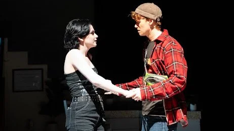
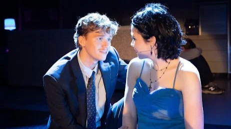
Starting with Diana’s costume, it was important that she reflected the environment, simple and neat but fractured. This was conveyed through her clean white/black shirt and blue jeans with a slightly unkempt and messy hairstyle. This resemblance felt important as Diana is the character most deeply entrenched in mental illness and suffering, hence finding comfortability in becoming recluse in her own home. Following this were Dan’s costumes, who wore mainly blue to provide a sense of comfort and calm to situations, however he also wore grey at times - symbolising the troubles he is hiding beneath his protective and stoic persona. Gabe’s outfit was an inverse of Dan’s as I believed it was important to hint at Dan’s fear of facing grief and the love he has for Gabe.
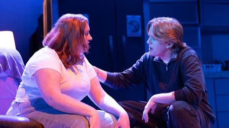
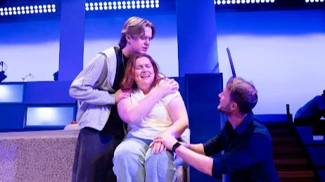
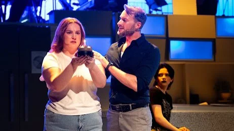
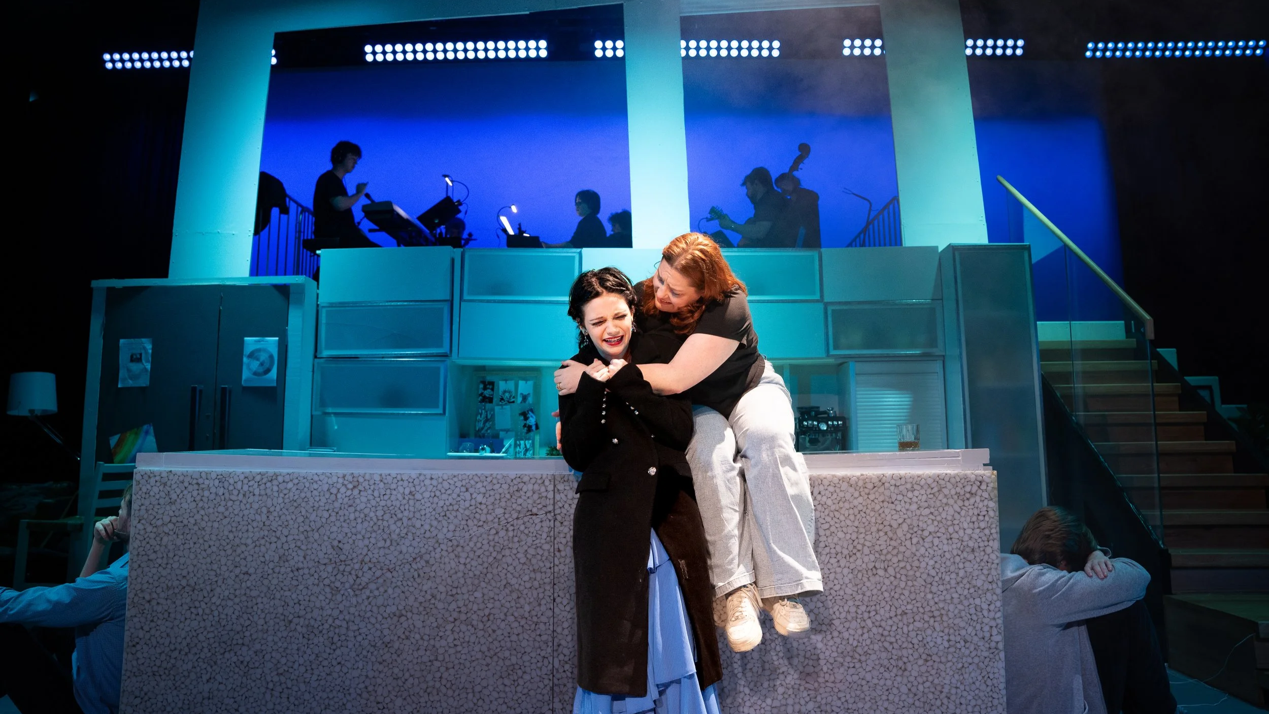
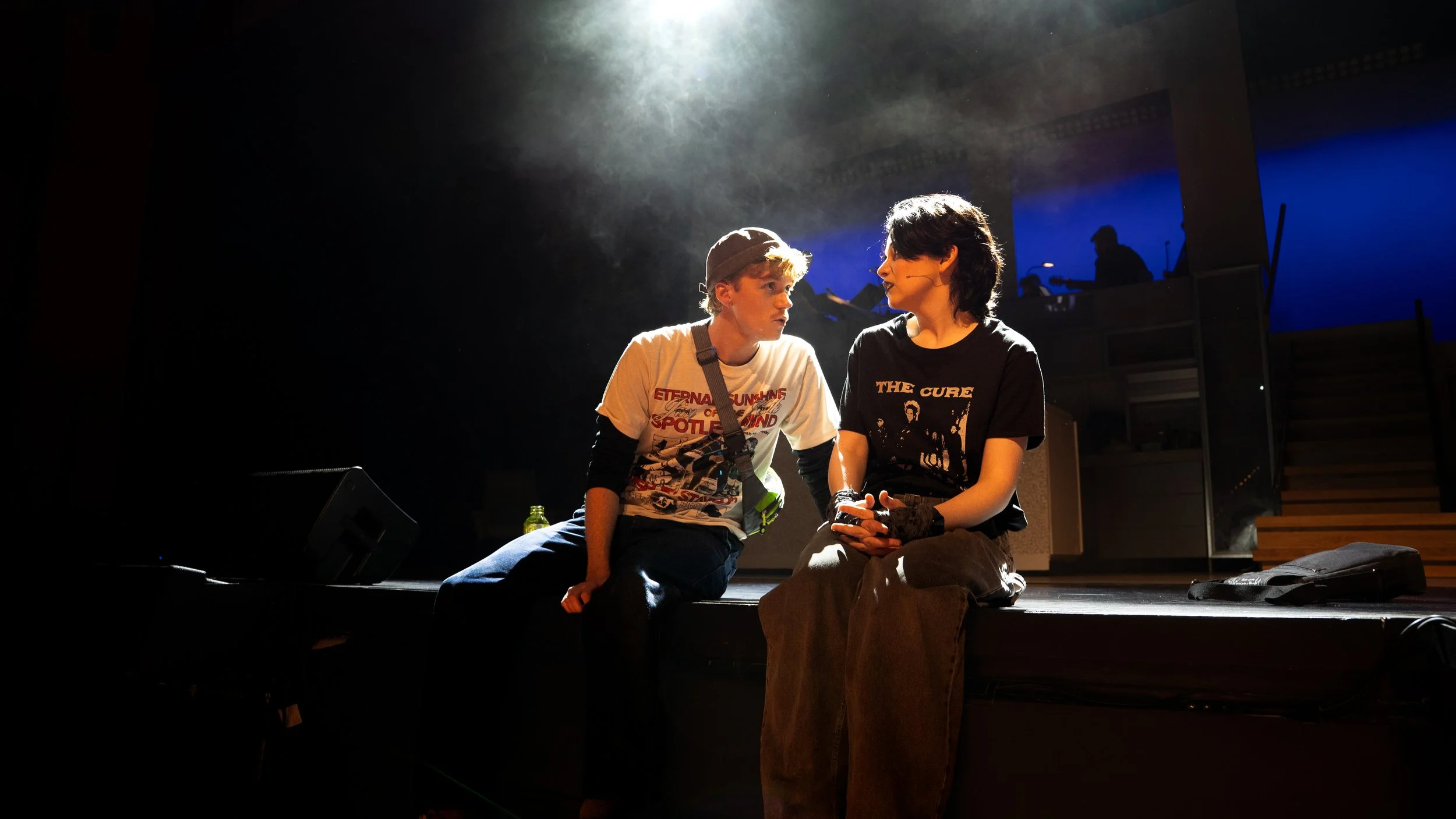
It was essential that the characters wore outfits that were not outdated but accurate to this generation - not social media fashion trends, but authentic representations of the characters as if they were among us. This was especially important for Natalie and Henry as they are two Gen Z teens - whereas Gabe is timeless. When I watched the show my first thought for Natalie was to make her alternative/goth, this makes sense considering she feels invisible and unheard and additionally in the sense of how different and unsettled her life is compared to others. Her mother also describes her as a “freak”, pushing Natalie to further reject conformity. Henry is also alternative, bust since he is a stoner I wanted him to wear movie and band tees - as per my own experience with guys like him in high school. The t-shirts weren’t random but rather easter eggs for the themes in the show - in Act 1 he wore “Eternal Sunshine of the Spotless Mind” and in Act 2 he sported a “Radiohead” t-shirt. I didn’t expect audiences to pick up on this but it was definitely a fun feature to add!